MedTech · Legacy Brand Refresh · Clinical Software UI · Website
Diapulse had decades of clinical credibility in pulsed electromagnetic field therapy but a visual identity that had not evolved in years.
Outdated branding, inconsistent materials, disconnected device software, and hardware that appeared disconnected from the current brand were creating a gap between the product's medical authority and how modern healthcare professionals perceived it.
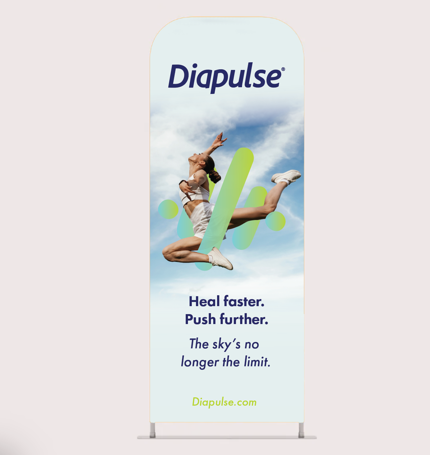
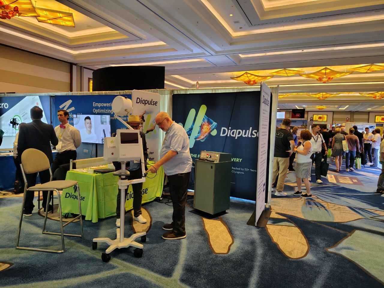
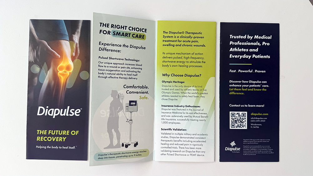
A comprehensive brand refresh built on one strategic decision: preserve the equity, modernize everything else. New logo, wordmark, typography, color system, brand guidelines, marketing and exhibit materials, all while keeping the pulse motif and core palette HCPs recognized.
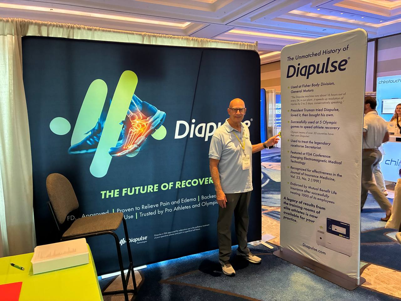
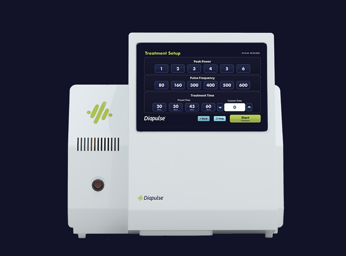
Diapulse was rebuilt to be scalable, and credible across every touchpoint. Extended into hardware color and logo placement on the physical device, and UI redesign for the clinical device software now live in use.
Diapulse has been a legitimate force in medical technology for decades. Their FDA-cleared pulsed electromagnetic field therapy devices have been used in hospitals and clinical environments to support healing and recovery.
The science is real. The clinical track record is real. But the brand did not reflect any of it.
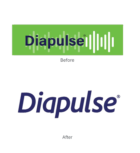
The logo was overly complex and did not scale. Marketing materials were inconsistent, and the device software felt disconnected from any coherent design system.
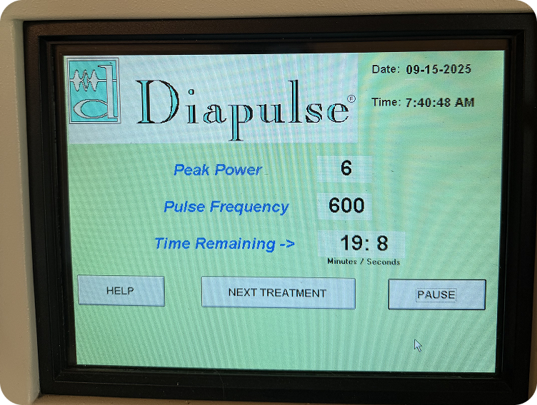
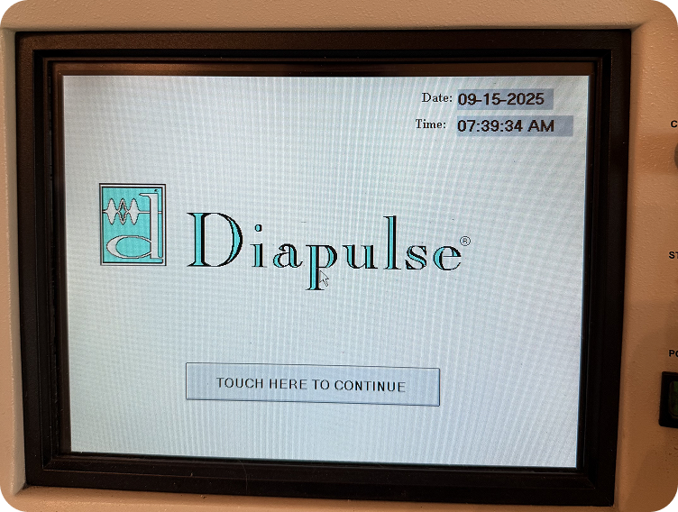
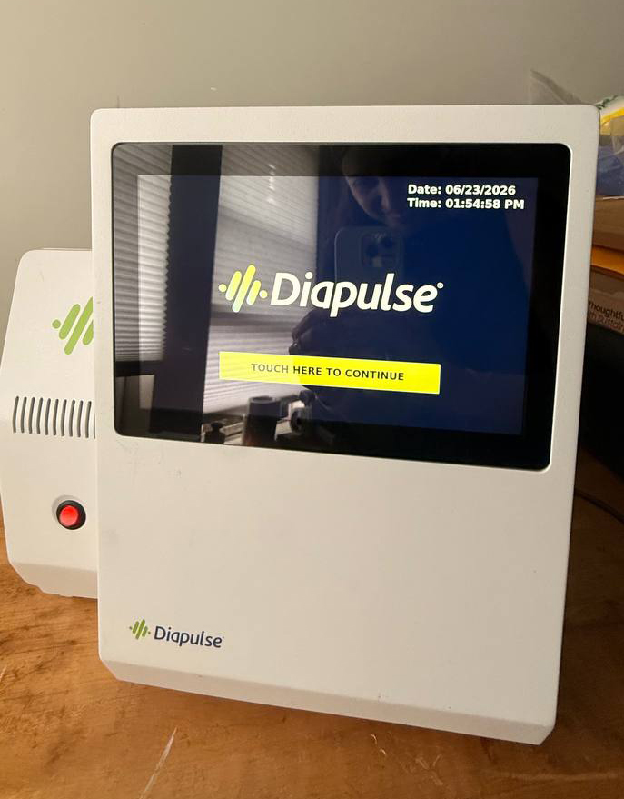
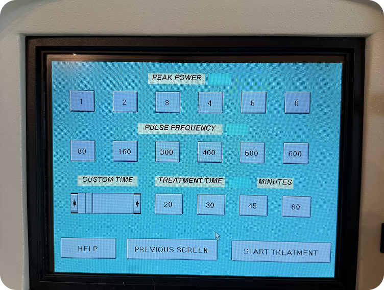
Legacy device software screens before the UI redesign, inconsistent visual language across splash, treatment, and settings screens.
Diapulse's pulse-inspired visual language had real recognition value in the clinical community. Removing it entirely would have been the wrong move. I kept those foundational elements and rebuilt everything else around them: cleaner, more scalable, and more considered.
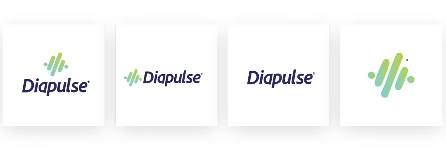
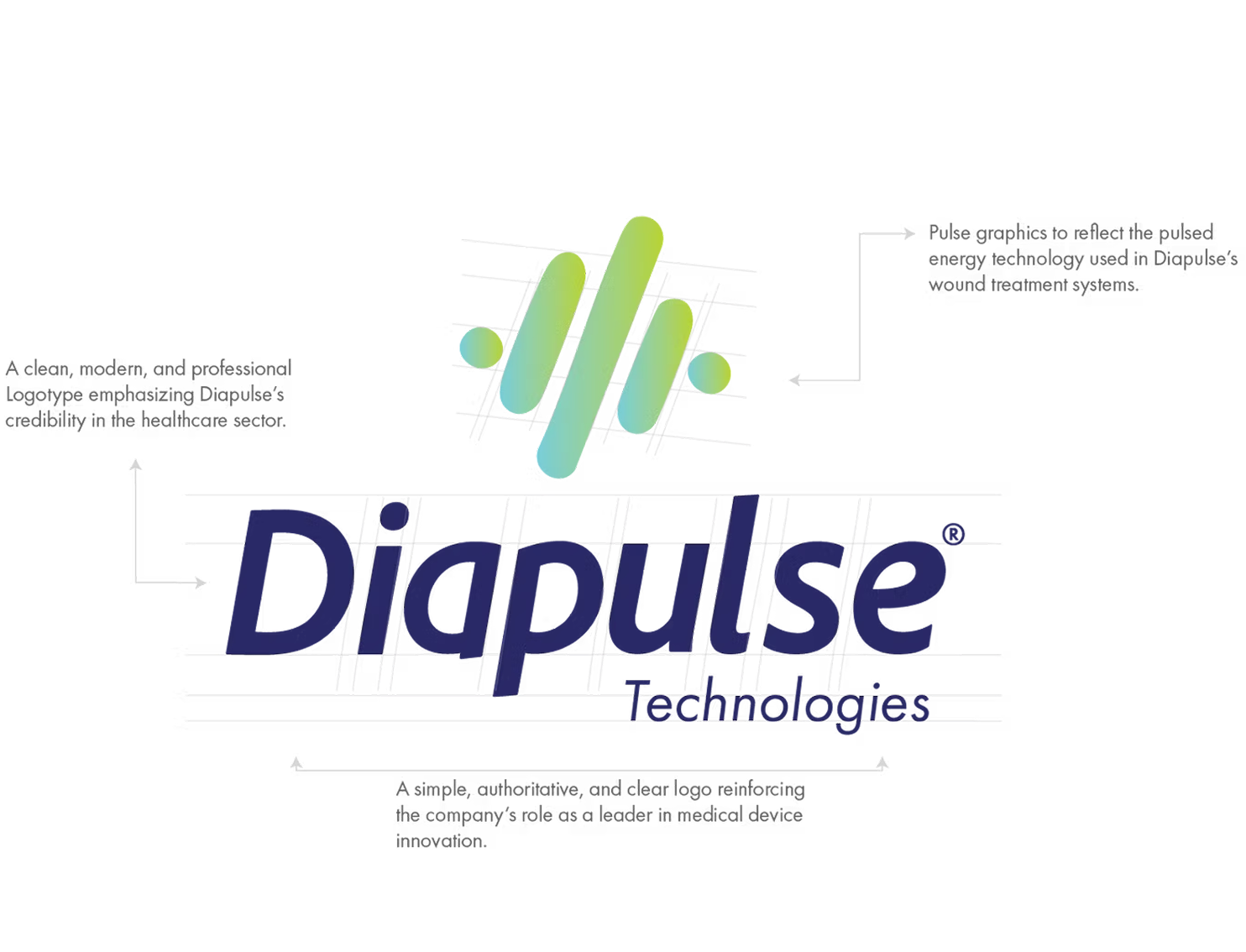
The original logo was visually overcomplicated. I redesigned it around a simplified custom wordmark paired with a modernized pulse motif, keeping the visual language HCPs associated with the brand while making it clean enough to work at any scale, across any surface, digital or physical.
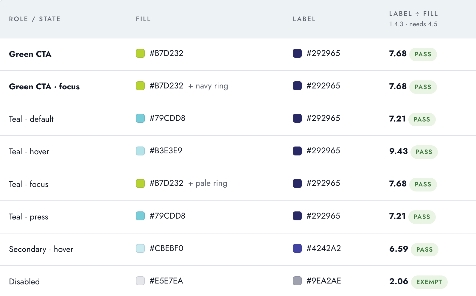
Updated the type hierarchy to prioritize readability in clinical contexts, environments where information needs to be processed quickly and without ambiguity. The color system was modernized within the existing palette, moving toward tones that read as professional and precise without institutional coldness.
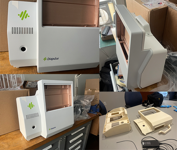
One of the more unusual aspects of this project was extending the brand onto the physical device itself. I worked with the product development team on hardware color selection and strategic logo placement, ensuring the device aligned with the updated brand system.
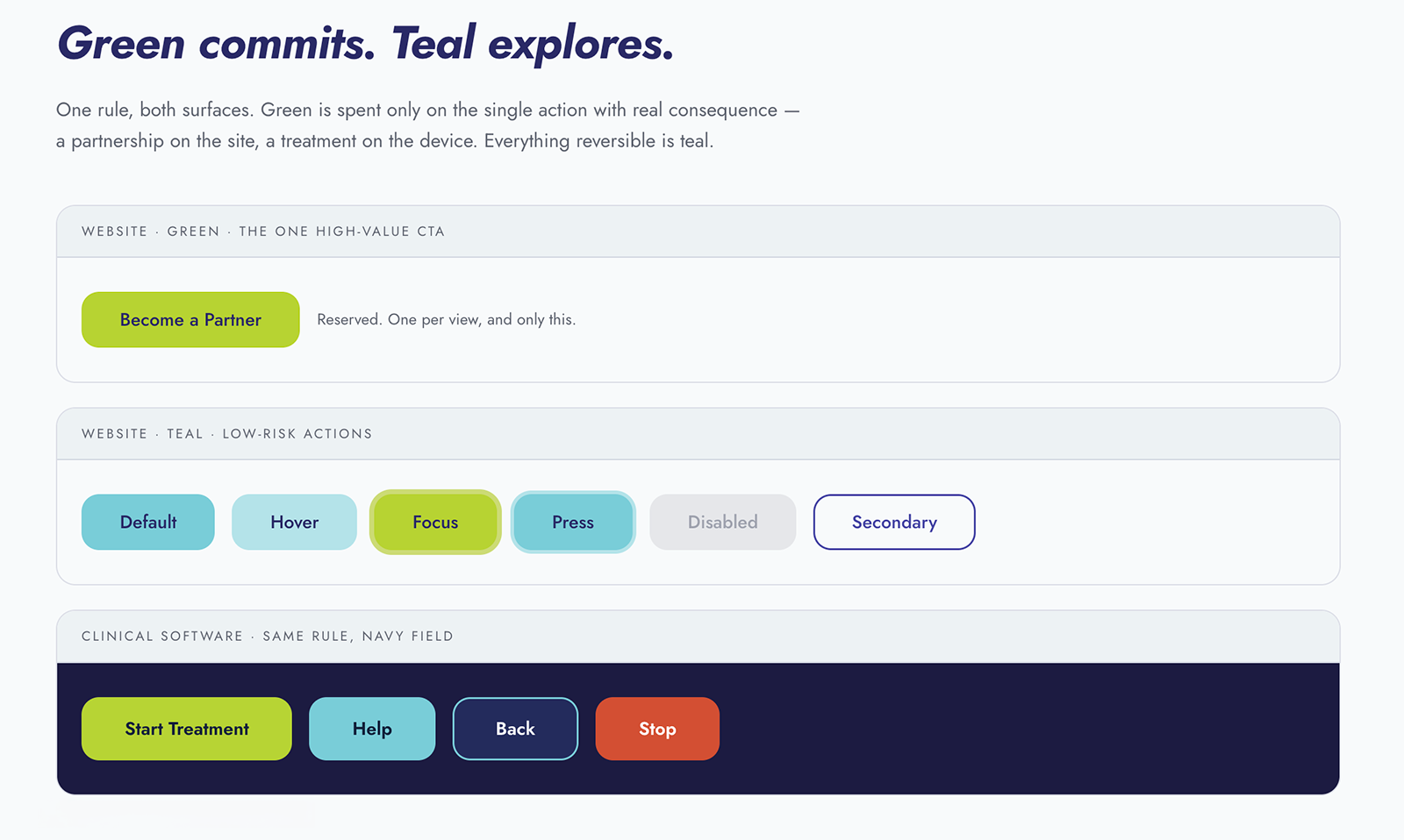
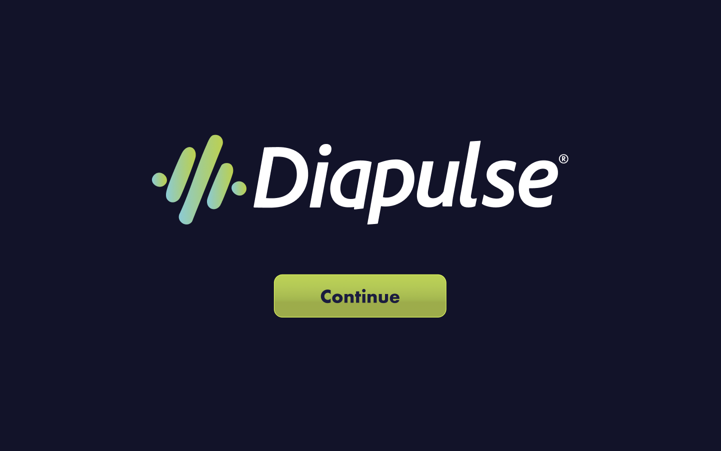
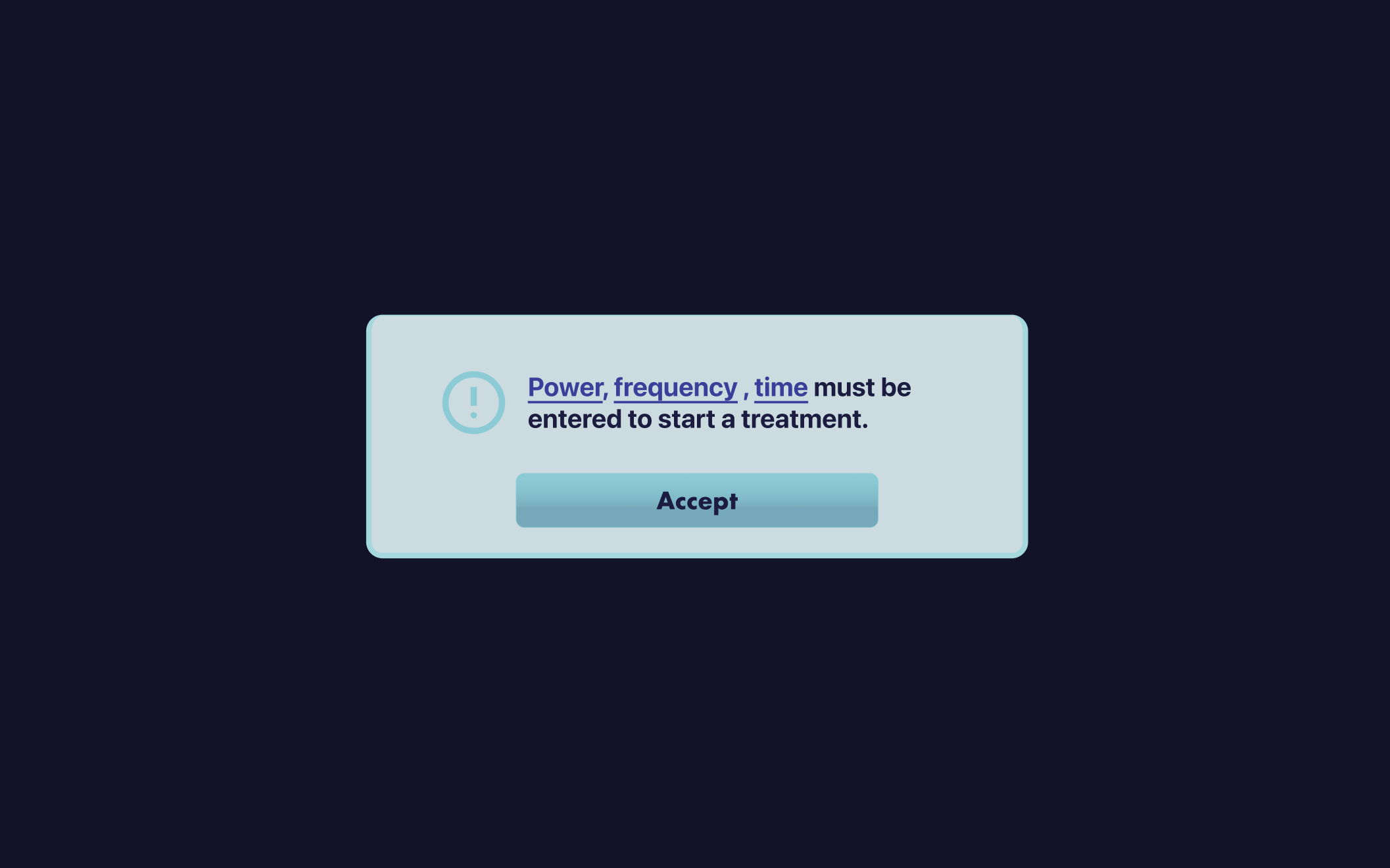
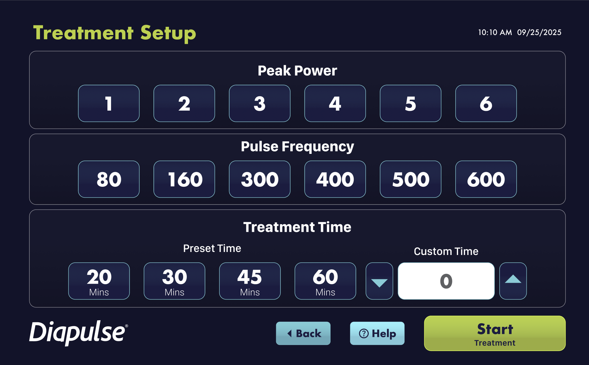
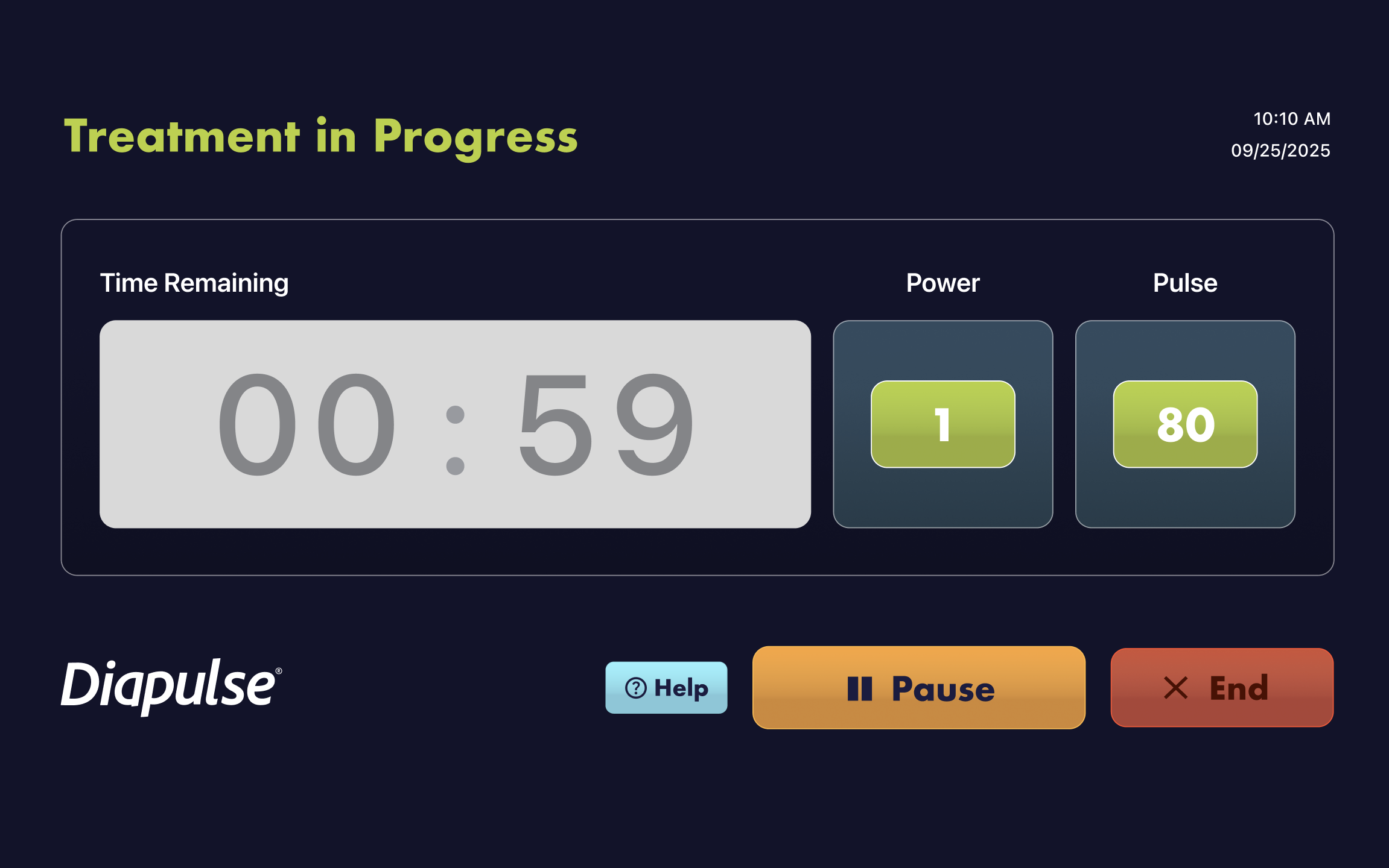
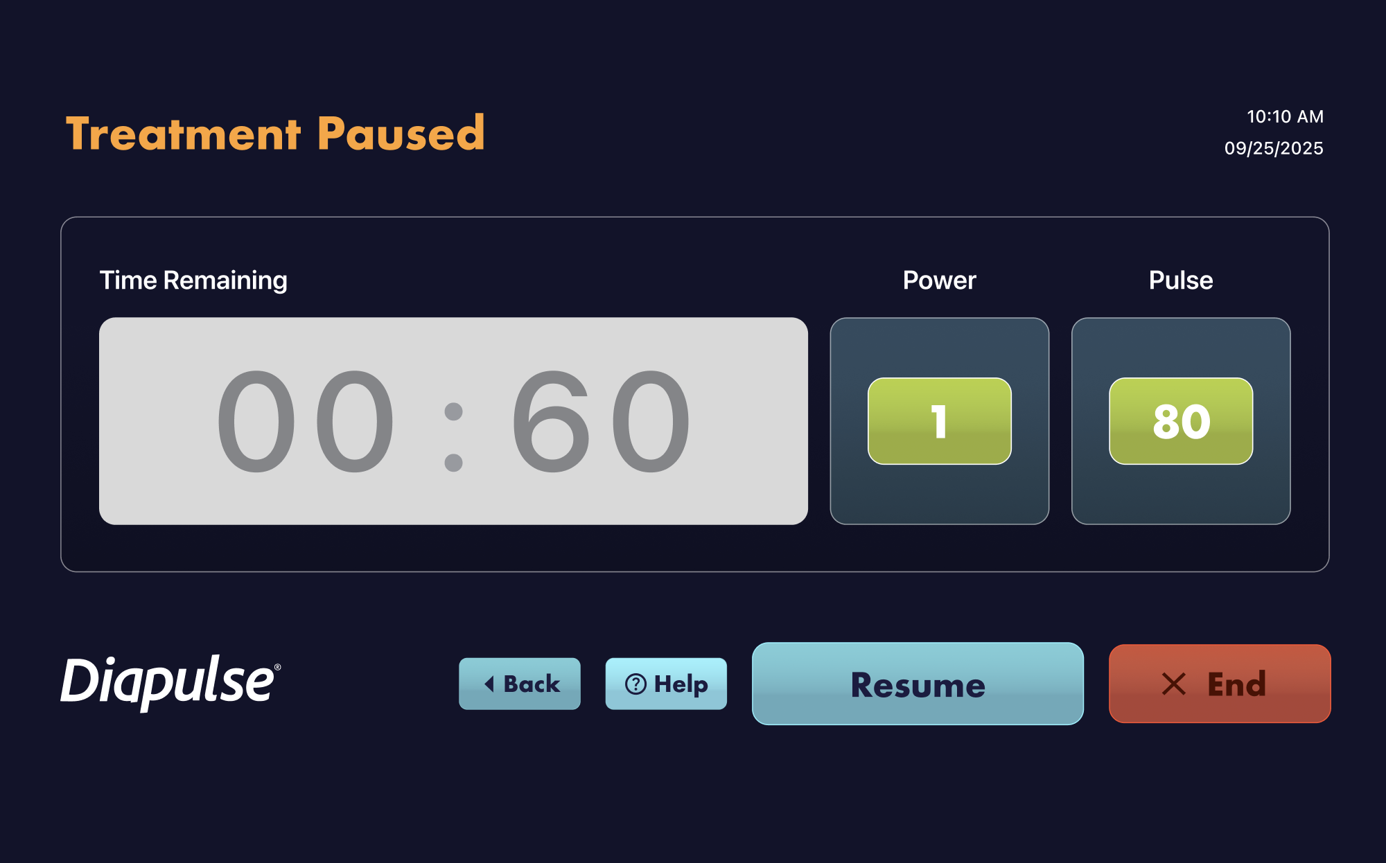
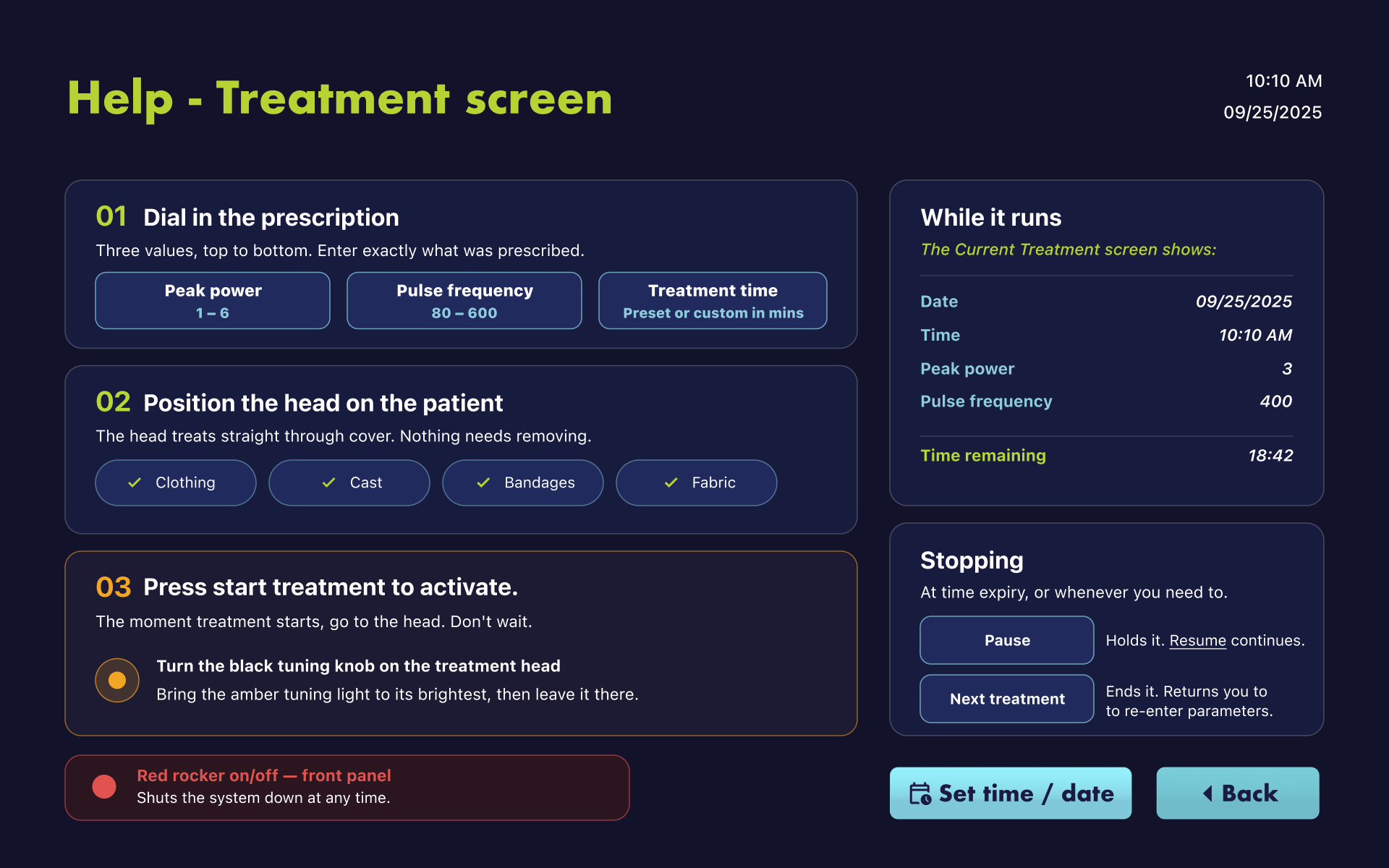
I led the UI redesign for Diapulse's clinical device software, used by healthcare professionals in active treatment settings. The software is the primary interface between the clinician and the device: every UX decision has a direct impact on how confidently and efficiently a clinician can do their job.
The redesign focused on reducing cognitive load in high-pressure environments, consistency with the brand system, and scalability for future features.
The software is live and in use in clinical settings today.


Diapulse went from a visually fragmented, outdated presence to a unified healthcare technology brand with a coherent system across identity, hardware, and software. The rebrand was fully adopted and rolled out across all materials. The updated software is live in clinical environments.


The software UX was built from product team input and technical specs, which gave me strong functional clarity but limited direct visibility into how clinicians use the device in practice. With more access, I would have embedded observational research: watching HCPs use the software in real clinical environments.
Legacy isn't a liability; it's a design constraint. The best thing you can do with a 30-year-old brand isn't to start over, it's figure out what equity is real, protect it deliberately, and rebuild everything else around it. That's a harder problem than a blank canvas, and a more valuable skill.

Clinicians evaluating the device for their practice and patients researching a treatment option arrive with fundamentally different questions, one is assessing clinical efficacy, the other is deciding whether this is right for them. Rather than solving this with separate sites or a navigation fork that pulls the two audiences apart, the goal is a single experience that brings them together: one built on real research depth, but designed to be discovered, not just read. The site needs to be engaging enough that a first-time visitor wants to keep exploring, not just find an answer and leave.