Loading

RapiMD

Mobile App

Health Tech · Uninsured Patients · Trust Architecture · Ethical UX

The Challenge

Design a booking experience that earns trust before asking for anything.

More than 40 million Americans are uninsured, and many delay care because they cannot predict what it will cost.

Healthcare apps designed to help them consistently fail at the first moment of contact by hiding pricing behind sign-up walls, using opaque fee structures, and triggering the exact distrust these users already carry toward the healthcare system.

The Solution

A mobile-first healthcare booking platform for uninsured and self-pay patients, built entirely around one promise: show users exactly what they will pay before they commit.

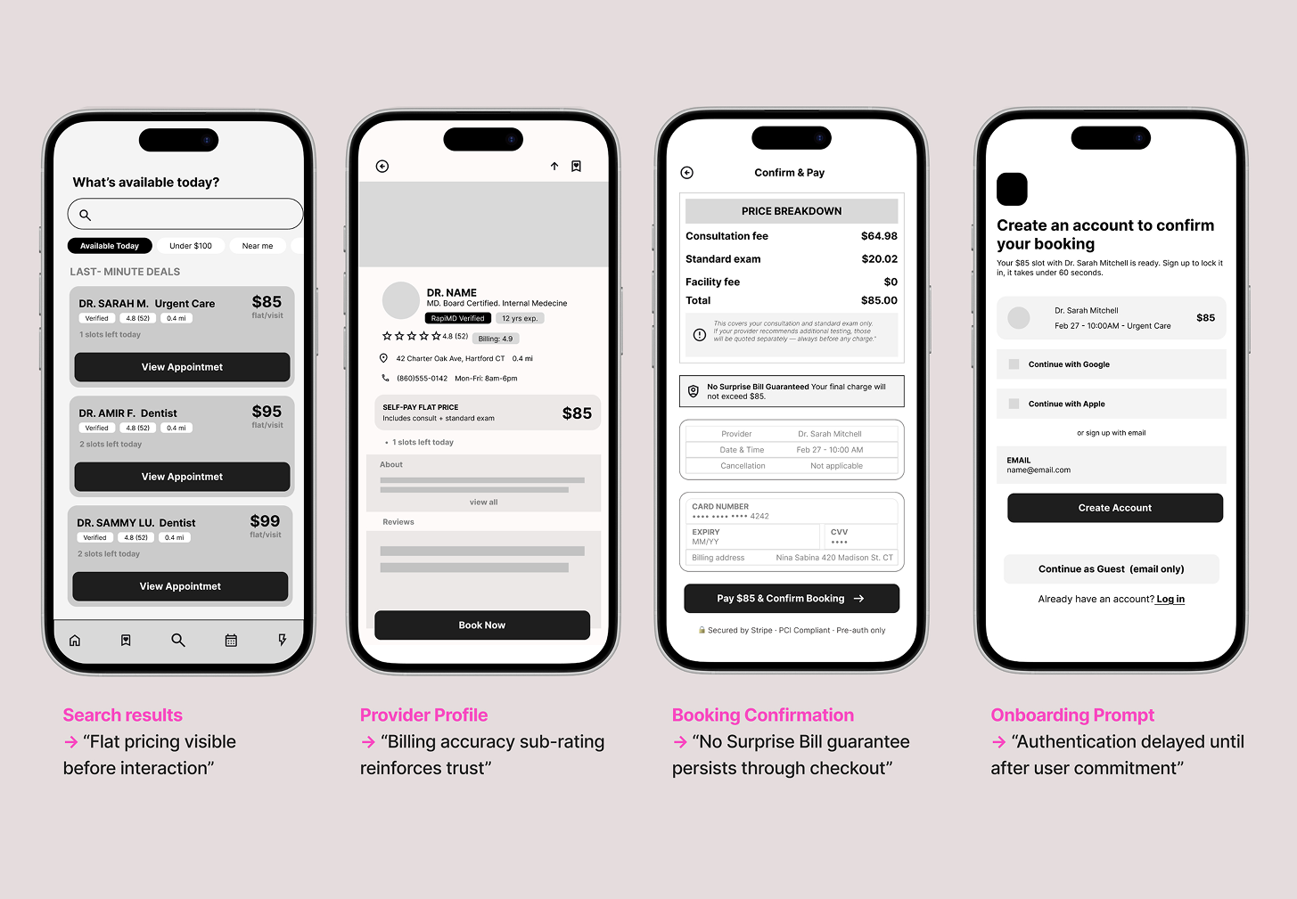
Delayed authentication until after users have seen pricing and availability.

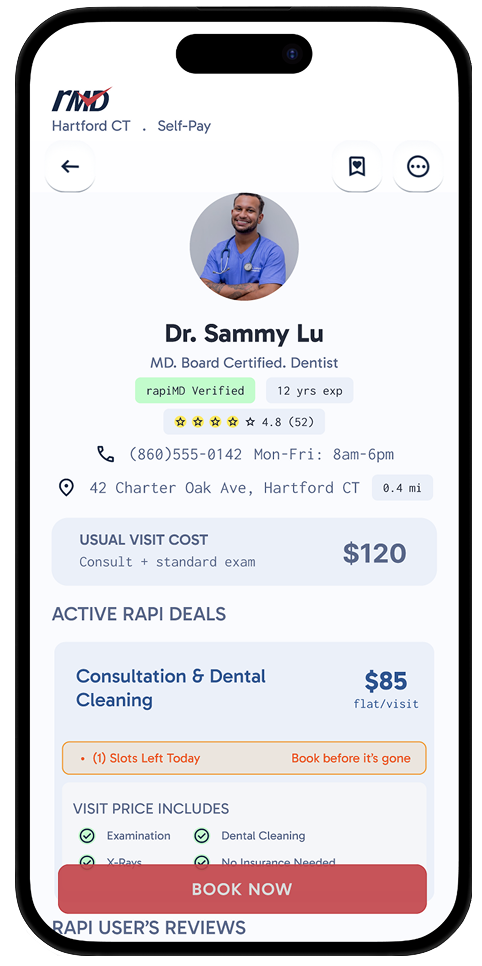
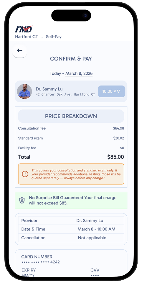
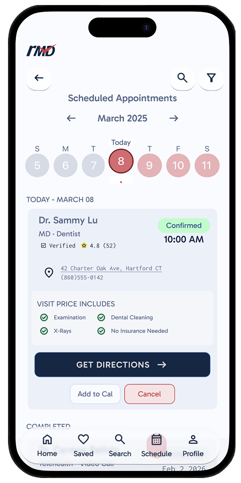
Flat-fee pricing on provider cards, billing accuracy sub-ratings, "What's Not Included" disclosures, and persistent No Surprise Bill messaging throughout the flow. Validated through moderated usability testing.

Academic project, designed end-to-end as a solo designer.

RoleSolo Designer
ScopeEnd-to-end
Timeline4 Weeks
Year2026
The Problem

The cost of care is a barrier before a single appointment is booked.

Uninsured Americans (roughly 26 million people) face a healthcare system designed around insurance. Searching for a provider means navigating a landscape of hidden pricing, credential ambiguity, and opaque booking flows.

RapiMD's core hypothesis: if you show uninsured patients the exact cost of a visit before they commit, and give them enough information about a provider to feel confident booking, you remove the primary barrier to care.

The design challenge was making that transparency feel trustworthy, not transactional.
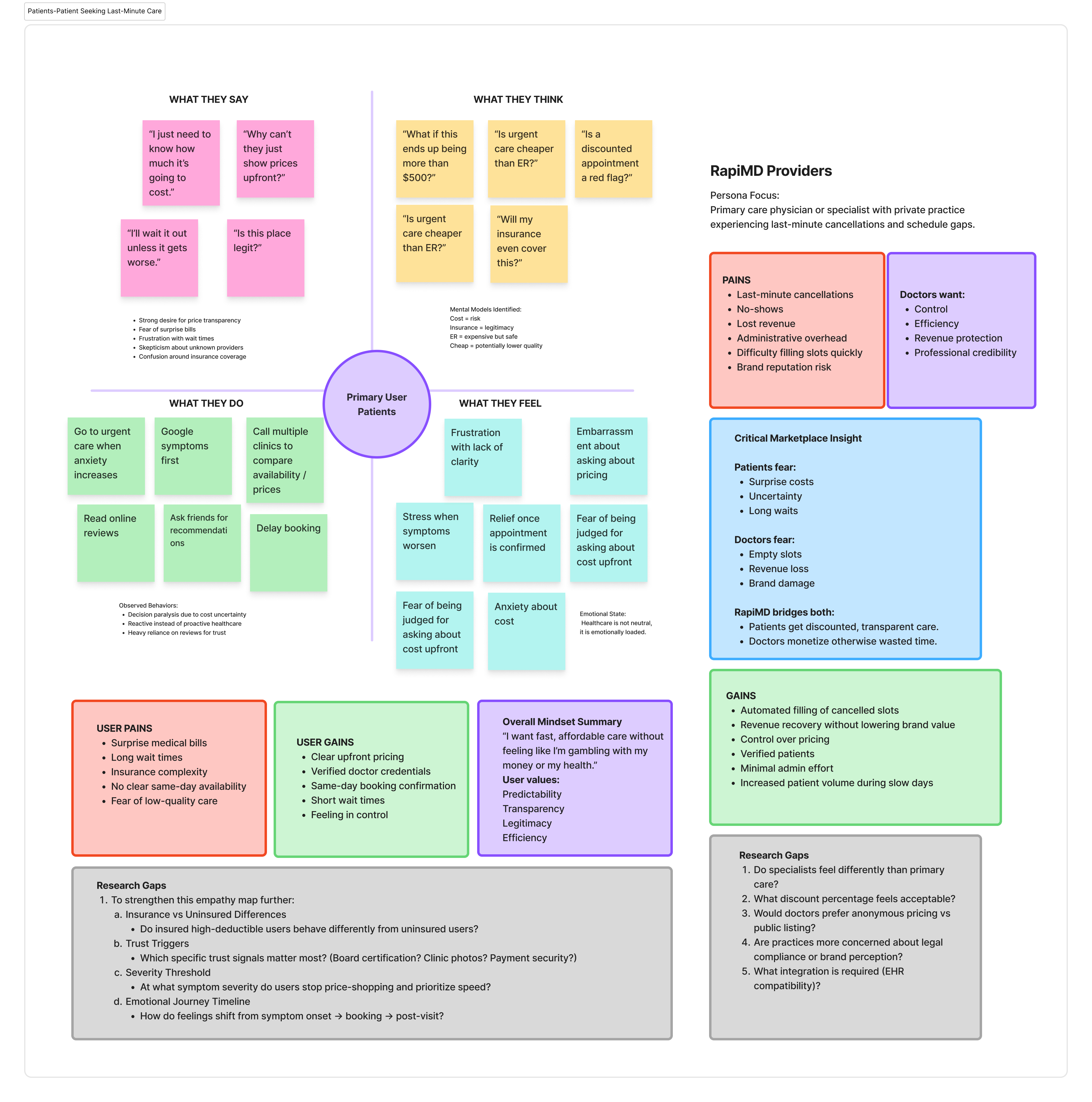
RapiMD empathy map

Who I designed for

Nina Sabina
Nina Sabina
28 · Connecticut · Freelancer
Extreme Cost Sensitivity
UninsuredSelf-PayPrice-Shops
"I don't avoid doctors because I don't care about my health; I avoid them because I can't afford them."
About

Nina hasn't had insurance in several years. Every medical visit is a financial decision, she saves up calls to compare prices, and delays or avoids care if she can't get a clear number upfront. She's been burned by surprise fees and vague "starting at" pricing. She researches more than she books.

Goals & Motivations
  • Know the exact total cost before committing
  • Avoid surprise bills or fees after appointments
  • Find one place she can trust for pricing info
Pain Points
  • Vague "starting at" pricing
  • Surprise charges upon checkout
  • Feeling penalized for being uninsured
  • Hours spent calling clinics to get quotes
What Would Win Her Over
  • Flat price upfront before booking
  • No hidden fees guarantee
  • Clear breakdown of what's included in visit price
  • Billing accuracy visible in reviews

The three-sided problem

Research

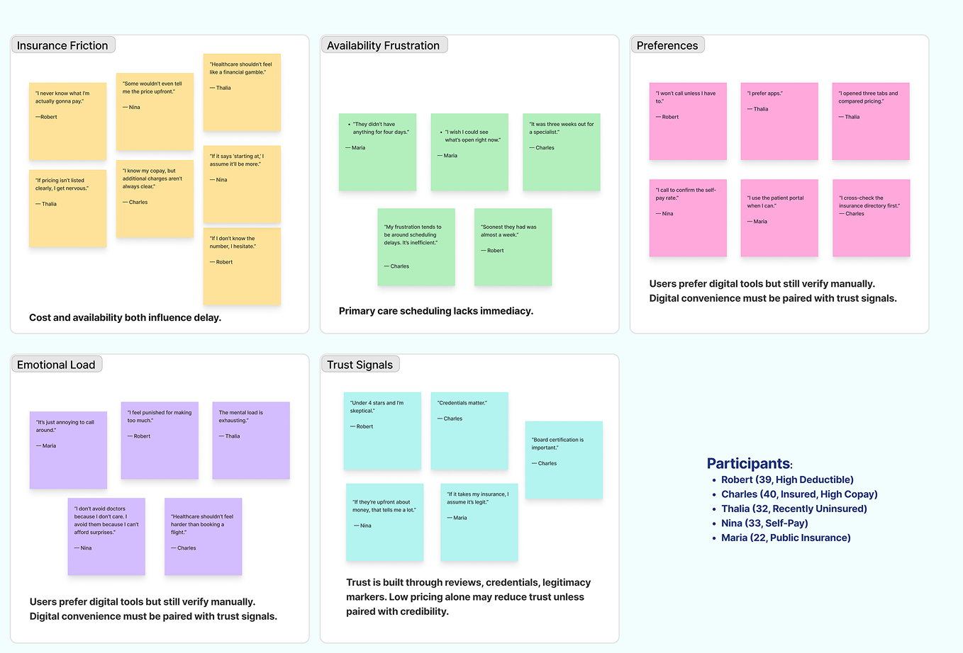
5 interviews. 4 actionable findings. 1 insight that shaped every product decision.

Pricing unpredictableCosts unknown until after the appointment, sometimes weeks after.
Hidden chargesUnexpected fees appeared regularly after visits, compounding distrust.
Same-day availability required manual coordinationFinding same-day availability required calling multiple offices manually.
Systemic trust erosionUsers were not uninformed. Experience had taught them that engaging cost more than they could predict.

The insight that shaped everything:
These users were not avoiding care because they were unaware of their options.

They were avoiding it because experience had taught them that engaging with the system cost more than they could predict.

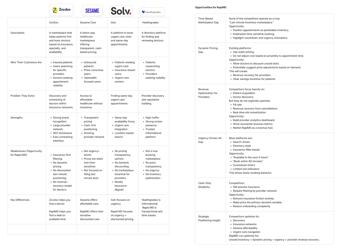
Four competitors reviewed.
None built for urgency, dynamic pricing, or unsold inventory.

Zocdoc, Sesame Care, Solv, and Healthgrades each solve a piece of the booking problem: insurance-based discovery, cash-pay transparency, same-day urgent care, or provider reputation. But none of them treat an open appointment slot as perishable inventory. Pricing across the board is static, urgency is an afterthought, and providers have no built-in way to recover revenue from cancellations or no-shows. That gap, unsold time with no dynamic pricing and no urgency mechanics, is exactly where RapiMD positions itself: a same-day, price-optimized marketplace that turns empty slots into booked ones.

RapiMD competitor analysis
Delayed Authentication

The most important product decision.

Standard healthcare apps put account creation before value. For uninsured patients already primed to distrust systems that take without giving, this is a trust-ending moment.

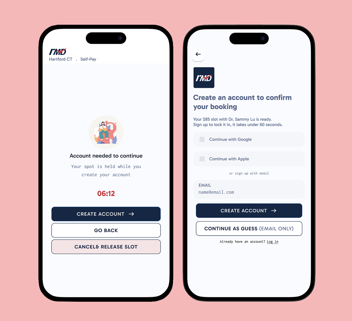
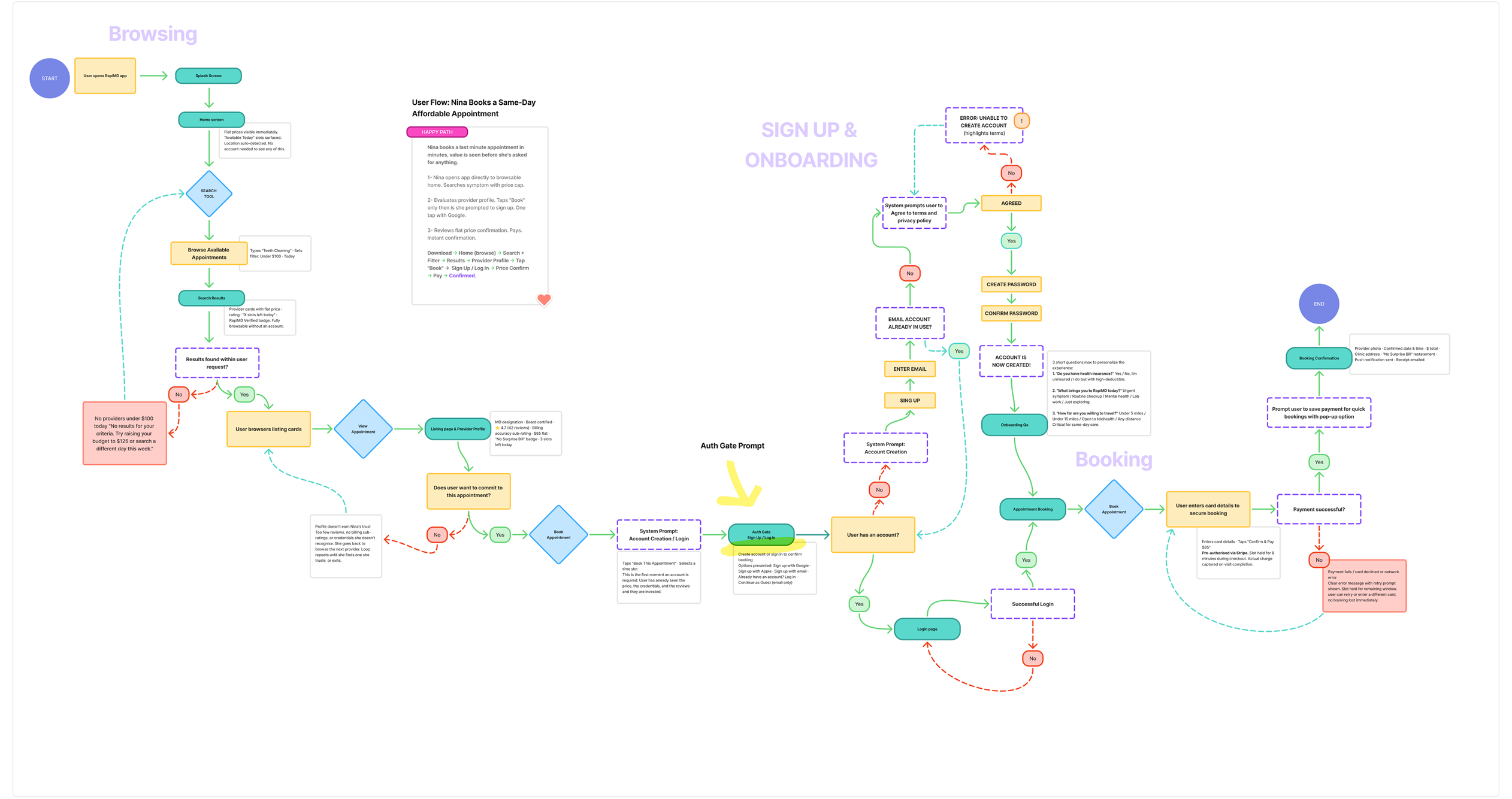
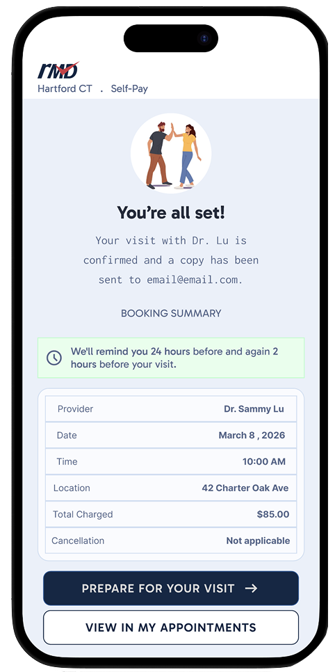
RapiMD flipped the sequence entirely. Authentication was delayed until after users had selected a provider and an appointment slot, after they'd seen the flat fee, confirmed availability, and decided they wanted to proceed.

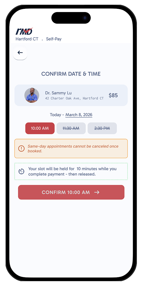
To prevent slot abandonment, the app reassured users their selected appointment was being held while a streamlined account creation flow was required to confirm and lock in the booking.

Slot-hold countdown screen
Logo & Brand Identity Rationale

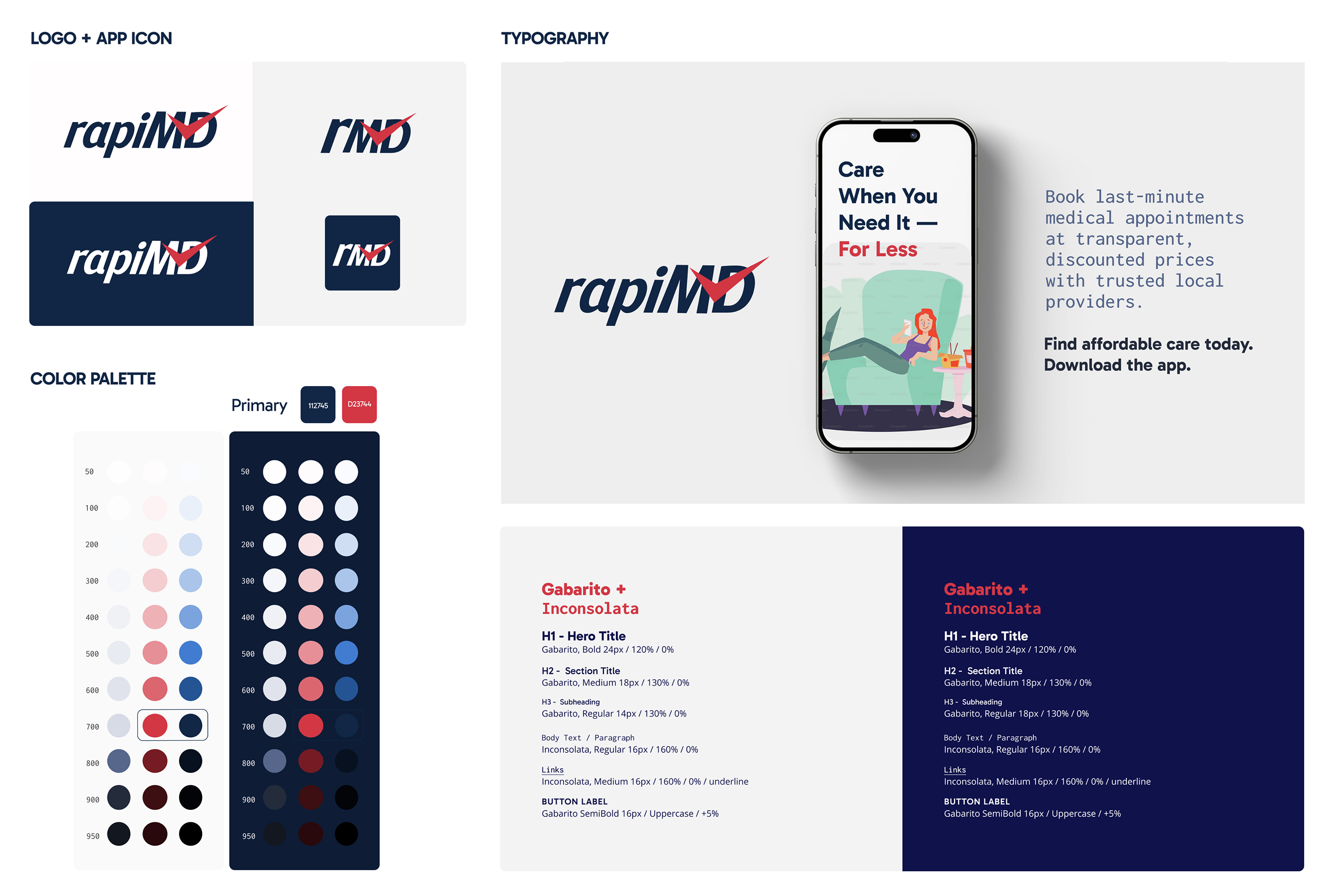
The rapiMD logo was designed to communicate the platform's core promise.

The logo uses a checkmark over the letter "D," signaling speed and medical completion: in healthcare, a checkmark means done, confirmed, safe. The lowercase "rapi" keeps the wordmark approachable and consumer-friendly, while the uppercase "MD" anchors it in clinical credibility, the same tension the product itself navigates.

Deep navy and red were chosen deliberately: navy builds institutional trust, while red appears exclusively on the checkmark accent and key CTAs, training the eye to pay attention when it matters.

The Gabarito and Inconsolata type pairing reinforces the transparency promise at a subconscious level, Inconsolata's monospace precision feels exact and receipt-like, aligned with a product whose entire value proposition is showing users exactly what they will pay.

Fast, confirmed, affordable care, in a single mark.

Brand Values

What RapiMD stands for.

Transparency

Healthcare pricing and availability should feel clear, not hidden or confusing.

Speed

Patients shouldn't wait weeks for care.

Trust

Medical decisions require emotional security.

Accessibility

Care should feel easy and inclusive.

Trust Architecture

Every screen was designed to build or maintain trust.

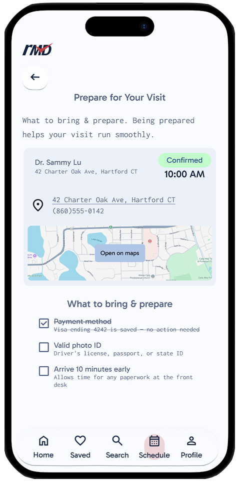
Trust architecture in healthcare UX means designing information hierarchy, interaction patterns, and visual language specifically to reduce patient anxiety and build confidence at each decision point. This included: transparent flat fees visible before login, provider credential display with verification signals, clear scope-of-service boundaries, and intentional friction at irreversible actions.

Trust architecture overview
Designing Transparency Into Every Interaction

Every screen. Every decision point.
Every place doubt could appear.

Usability Testing

Testing Focus:
Pricing comprehension, booking confidence, trust perception, data transparency.
Two failures emerged.

5Participants
9Screens tested
100%Task Completion Rate
45-60Minutes per session

Participants were interpreting itemized breakdowns as fees stacked on top of the flat fee, the exact opposite of what the design intended. Resolution: a dominant "Your total: $85 flat" summary line above the breakdown. In follow-up testing, the misreading disappeared.

Participants felt uneasy when location-based results appeared without explicit permission context. Resolution: explicit location permission prompt before any location-based results, with clear language about data use.

What This Project Taught Me About Trust

Trust is not a visual property.

You cannot design trust with only a color palette or reassuring headlines. Trust is built through clear expectations, explicit consent, transparent system behavior, and predictable outcomes through what the product does, not how it looks.

For uninsured patients who have been systemically failed by healthcare, uncertainty itself is a barrier to care. Every interaction pattern that introduced ambiguity was a product failure with real consequences for real people.

RapiMD Prototype
Reflections

What I Would Do Differently

With more time, I would run a second testing round specifically on the revised pricing hierarchy to confirm the revision held across different literacy levels. I would also have pushed the billing accuracy rating system further; it is the feature most likely to drive long-term platform trust and deserved more design depth in V1.

What This Project Proved

Trust is built through clear expectations, explicit consent, transparent system behavior, and predictable outcomes. Every ambiguous interaction pattern was a product failure with real consequences for real people.

rapiMD
Last-Minute Healthcare
Next case file

Diapulse