Loading

TiriVelo

Mobile App

Consumer Marketplace · Trust Architecture · Design System Assets

The Challenge

TiriVelo's pet care marketplace was losing users at the most critical moment: provider evaluation.

Search context disappeared mid-browse, filters looked functional but were not. Provider profiles lacked the trust signals users needed to commit, and a silent edge case allowed wrong-service bookings with no warning.

Users were reaching the decision point and losing confidence, not because providers were inadequate, but because the product was not giving them what they needed to decide.

The Solution

End-to-end redesign of the Search, Discovery, and Provider Profile flows for a real product in active development.

Persistent search context banners, a rebuilt filter system with grouped mental models, trust-signal-rich provider profiles, a three-tier CTA hierarchy, and an inline solution to the booking edge case, validated through moderated usability testing.

Team capstone project with cross-functional collaborators; this case study reflects my individual ownership of the Search, Discovery, and Provider Profile flows.

RoleUX Designer
ScopeSearch, Discovery & Profile
Timeline4 Weeks
Year2026
The Problem

Before a pet owner books a stranger, they need to feel certain. Not mostly sure.

TiriVelo is a pet care marketplace helping owners discover and book local pet care providers. When I joined the project, the booking experience was failing at exactly that critical moment.

Users were reaching the provider evaluation stage and losing confidence, not because the providers were inadequate, but because the product was not giving them what they needed to decide.

Specific problems: users lost search context after entering results; filtering was visually present but functionally broken; provider cards had weak trust signals; key information was fragmented behind tabs.

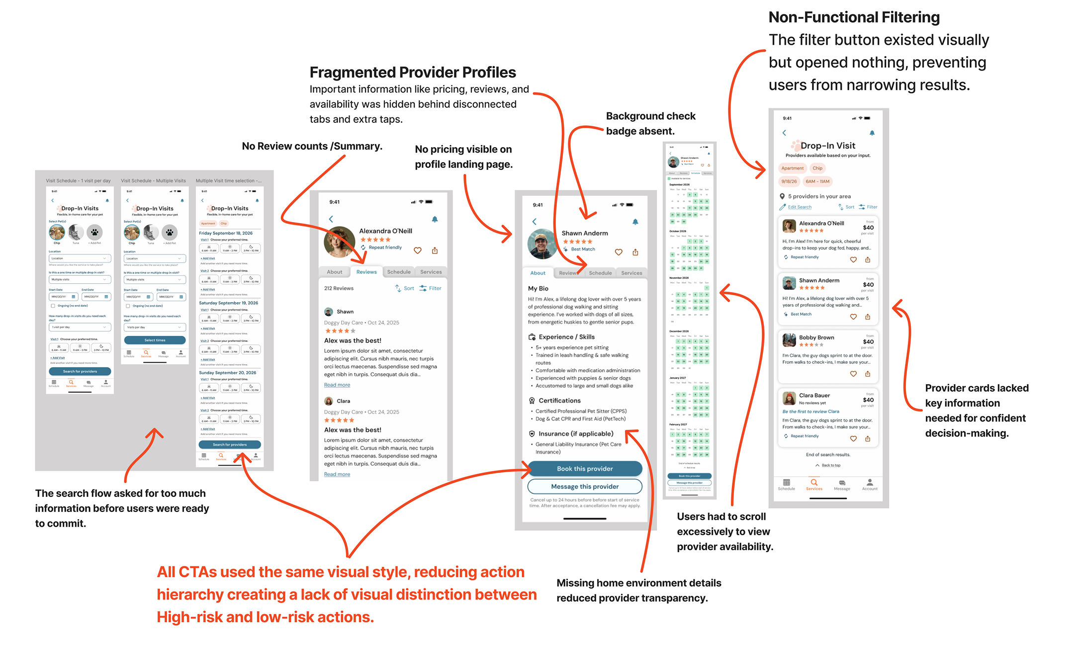
Diagnostic findings from the audit

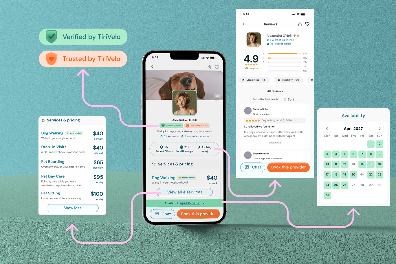
Critical information such as pricing, reviews, and availability was hidden behind disconnected tabs and extra taps: no review count or summary, no pricing visible on the profile landing page, and no background check badge.

The filter button existed visually but opened nothing, preventing users from narrowing results.

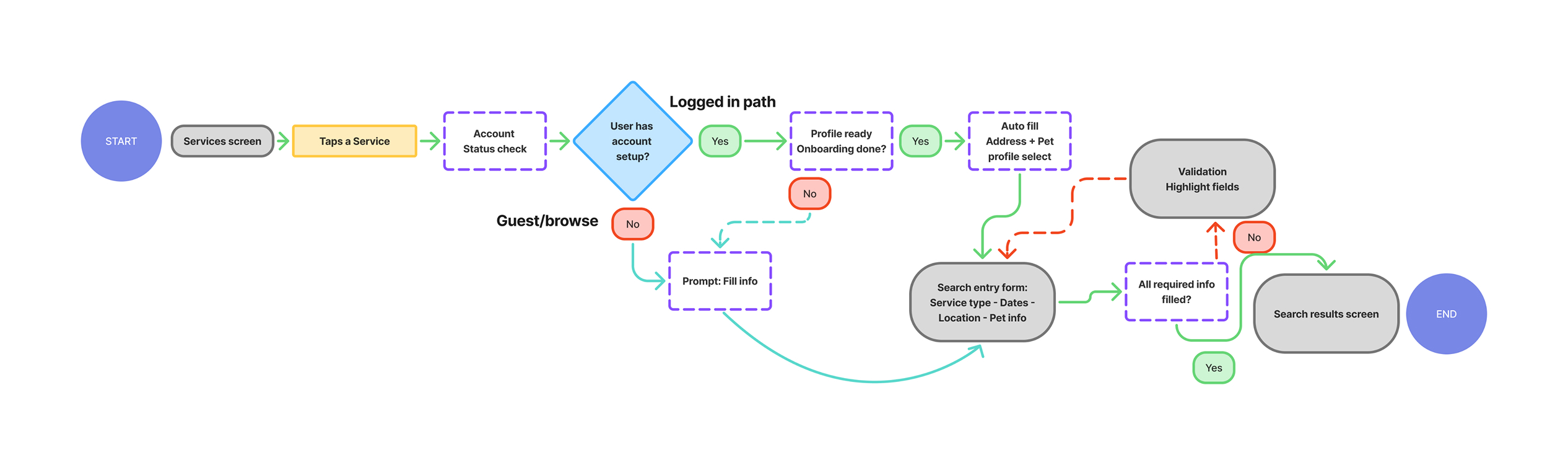
The search flow asked for too much information before users were ready to commit.

All CTAs used the same visual style, reducing action hierarchy, creating a lack of visual distinction between high-risk and low-risk actions.

Missing home environment details reduced provider transparency, and users had to scroll excessively to view provider availability.

Provider cards lacked the key information needed for confident decision-making at a glance.
Competitive Analysis

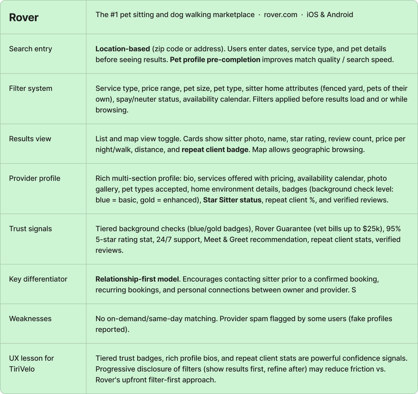
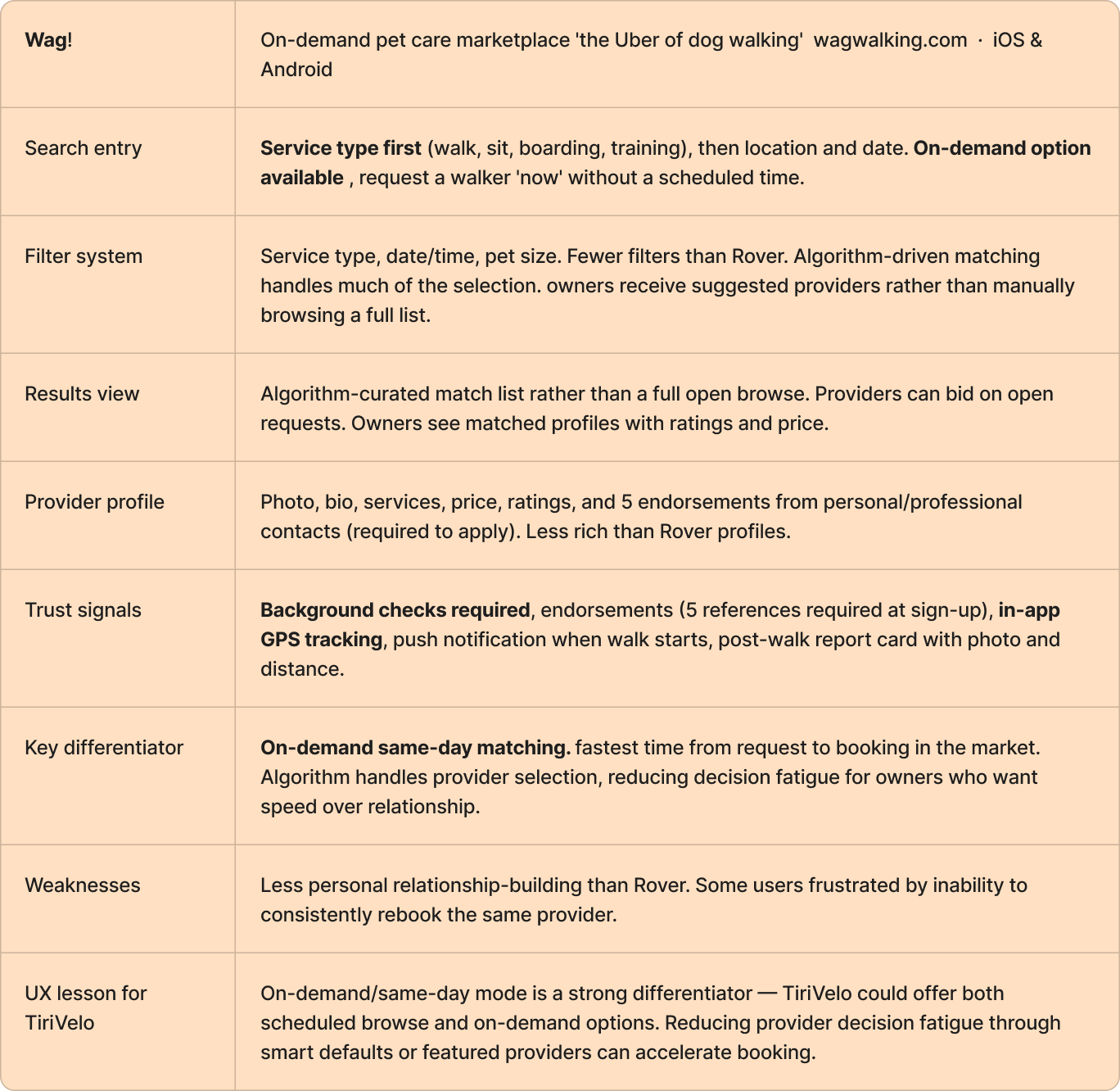
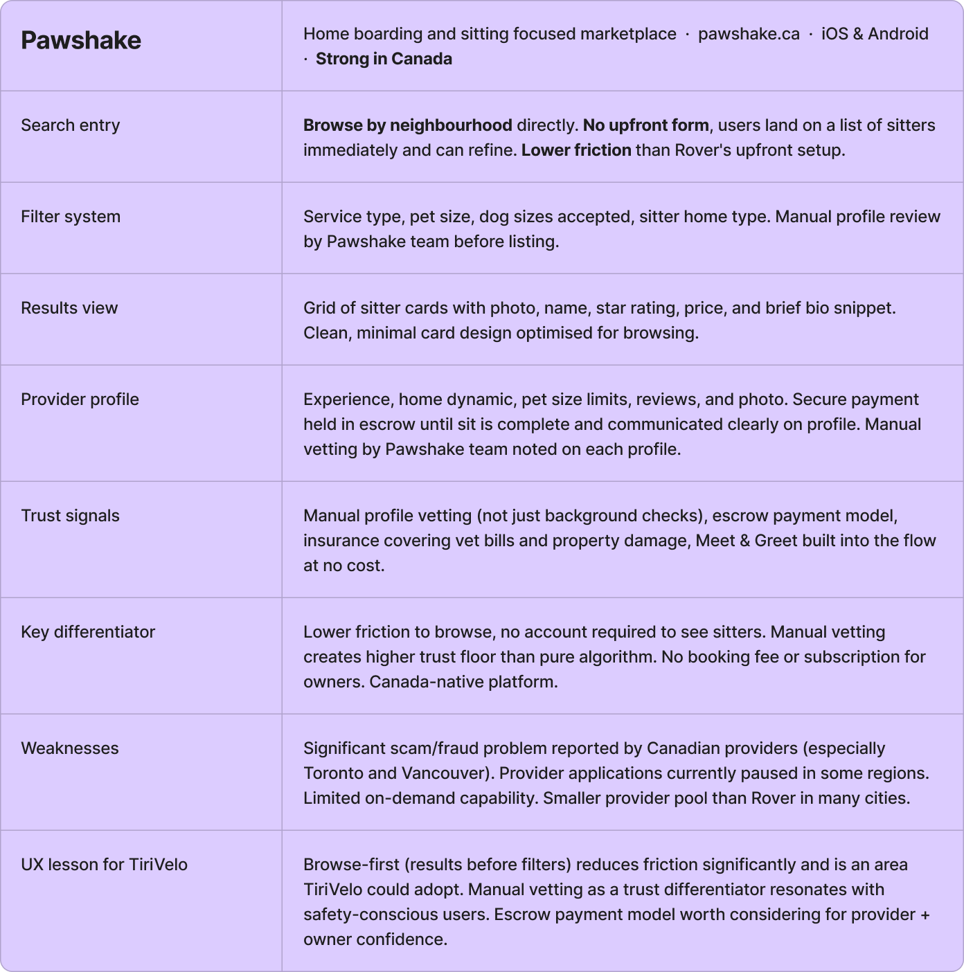
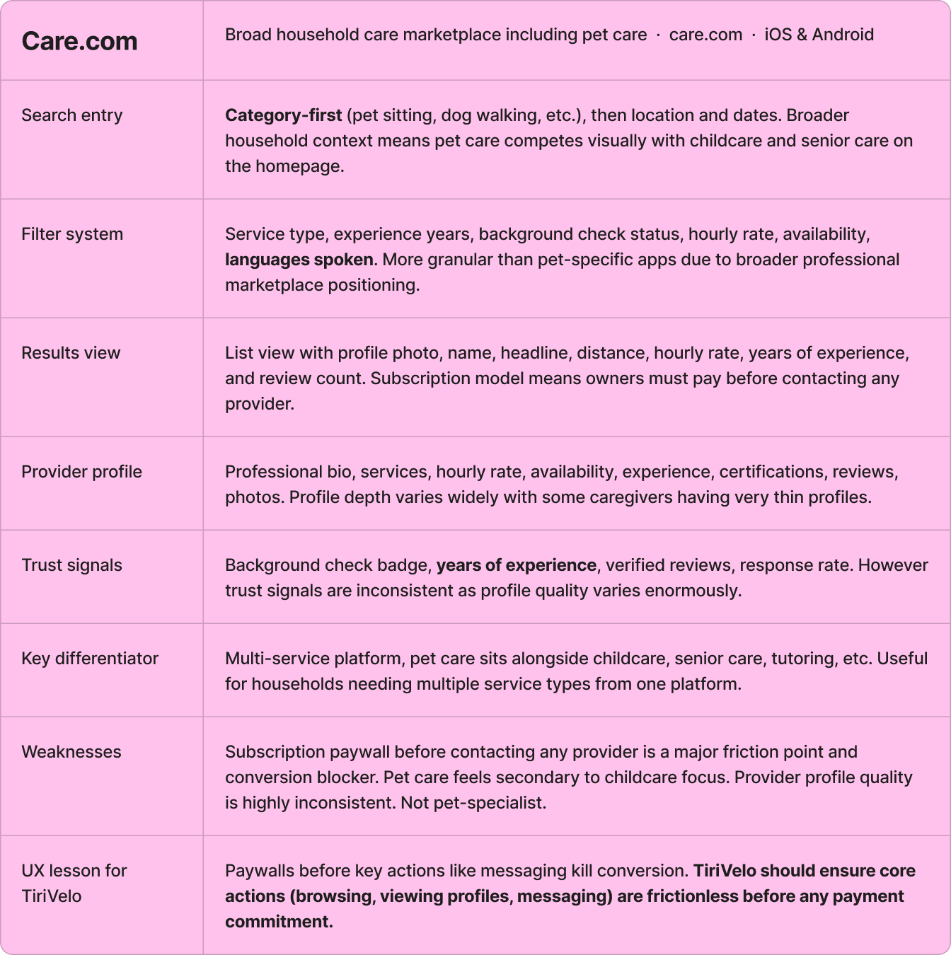
4 competitive platforms. One clear gap.

Rover competitive research screenshot
Wag! competitive research screenshot
Pawshake competitive research screenshot
Care.com competitive research screenshot
Redesigning Search

Orientation is a trust signal. When users lose context, they lose confidence.

The redesign introduced:

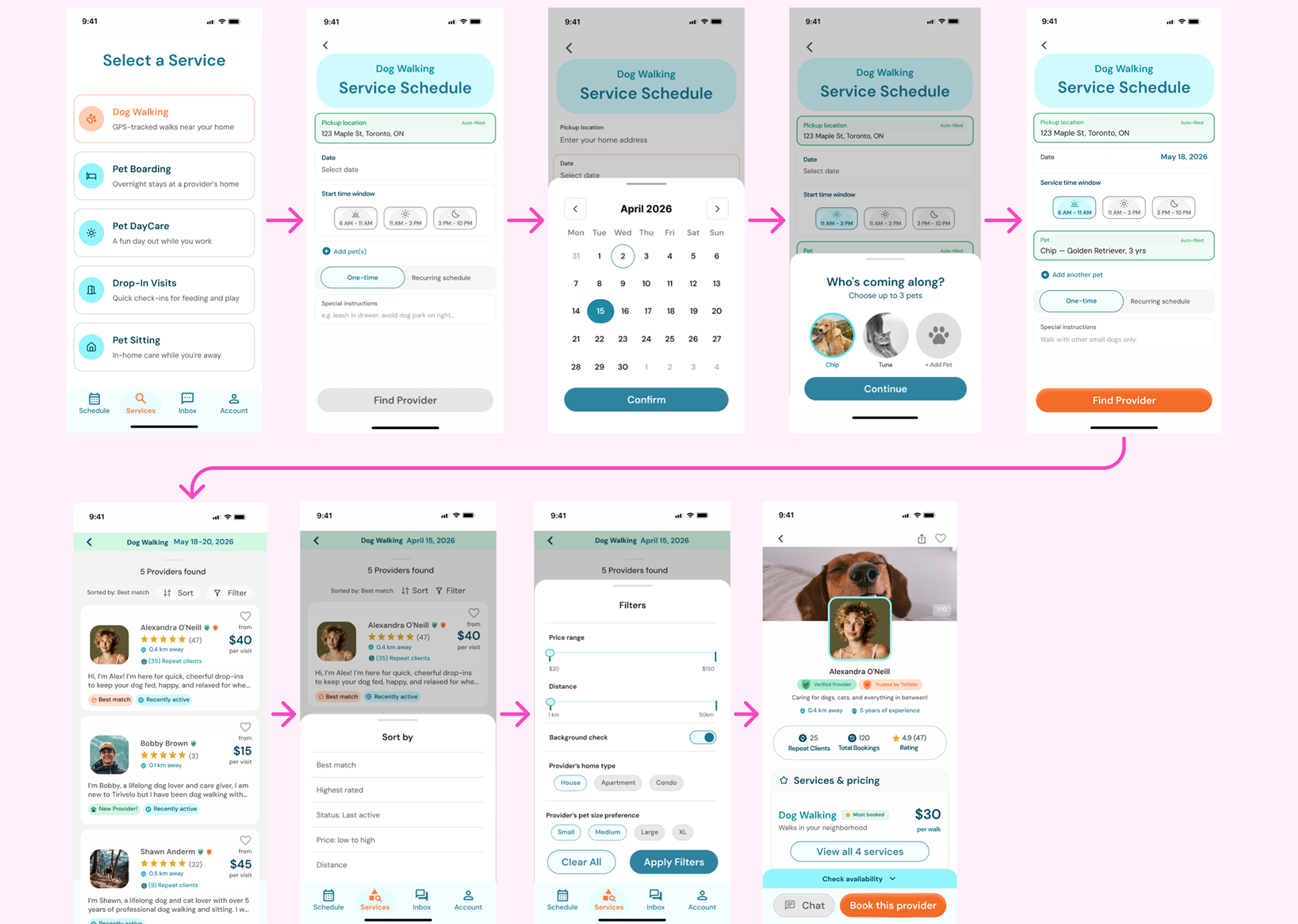
  • A persistent search context banner
  • Provider status indicators ("Active Now," "Trusted by TiriVelo")
  • Visible sort-state labels
  • Complete rebuild of filters using mental models.

The underlying principle: if users know where they are, they can decide with confidence.

Rebuilt filter panel
Designing the Booking Flow

What the flow is built on.

01 One decision per screen

Each screen asks for exactly one thing. Cognitive load stays flat no matter how long the flow gets.

02 Sheets over pages

Date and pet selection surface as overlays. The booking context never disappears behind a navigation push.

03 Guest-first

The flow runs to completion without an account. Registration is a consequence of booking, not a gate before it.

04 Disabled means unfinished

The primary CTA stays inert until it can succeed. A button that fails is worse than a button that waits.

05 Faces beat dropdowns

Pets are chosen by photo. Recognition is a faster operation than reading a list.

06 Waiting is designed

The matching state animates. A blank spinner reads as broken; motion reads as working.

Provider Profiles

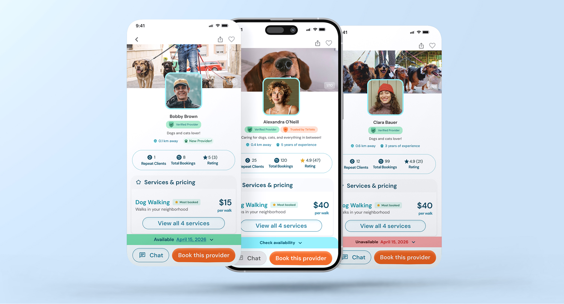
Profiles are where booking decisions are made or abandoned.

Key additions included:

  • Photo-first trust building
  • Verification badges
  • Repeat-client metrics
  • Environment information
  • Persistent booking actions
  • Availability reassurance
  • Review credibility indicators

The dynamic availability banner was designed to reduce booking uncertainty by adapting to the user's search context. If no date was selected, it encouraged exploration with "Check Availability"; date-specific searches provided immediate availability feedback to help users evaluate providers faster and with greater confidence.

Solving a Critical Edge Case

Wrong service selected silently → modal fatigue → inline solution.

During our first round of user testing, users could accidentally book a different service than the one they originally searched for.

A confirmation modal was initially attempted to solve the issue but created modal fatigue.

The final solution used inline selection states, persistent original search context, and clear service-switch messaging.

Usability Testing

Moderated testing with 5 participants across 9 screens in 45-60 minute sessions.

5Participants
9Screens tested
100%Task Completion Rate
45-60Minutes per session

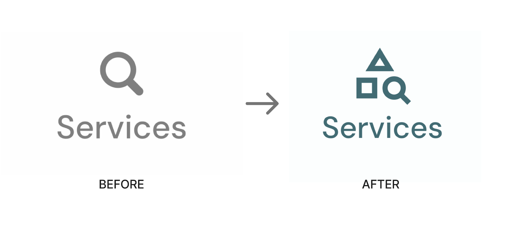
Combined service-category shapes with the magnifier to create a more specific and recognizable "browse services" interaction.

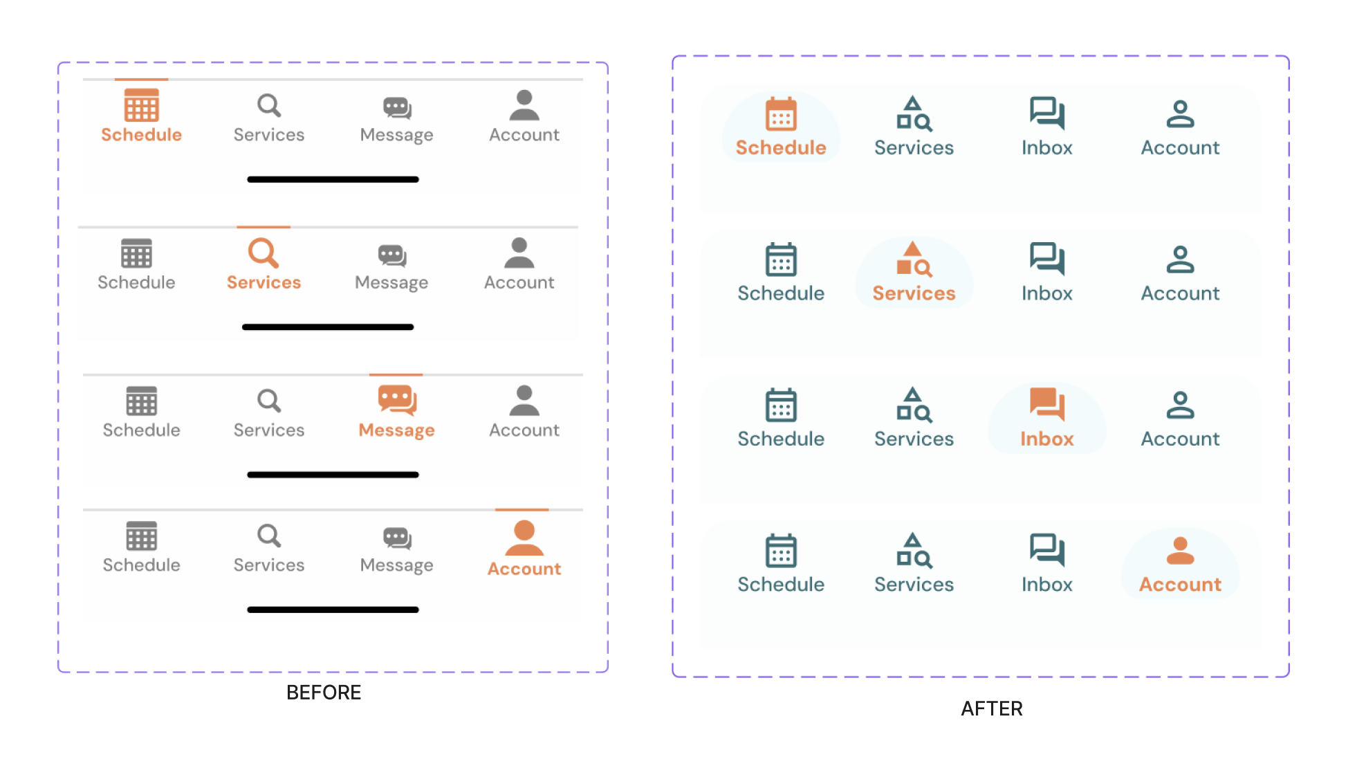
Updated navigation semantics

Renamed "Message" to "Inbox" to create clearer expectations around provider communication and booking updates.

Replaced the underline indicator with a filled background state to create a stronger, more scannable active-tab affordance.

Improved active navigation state

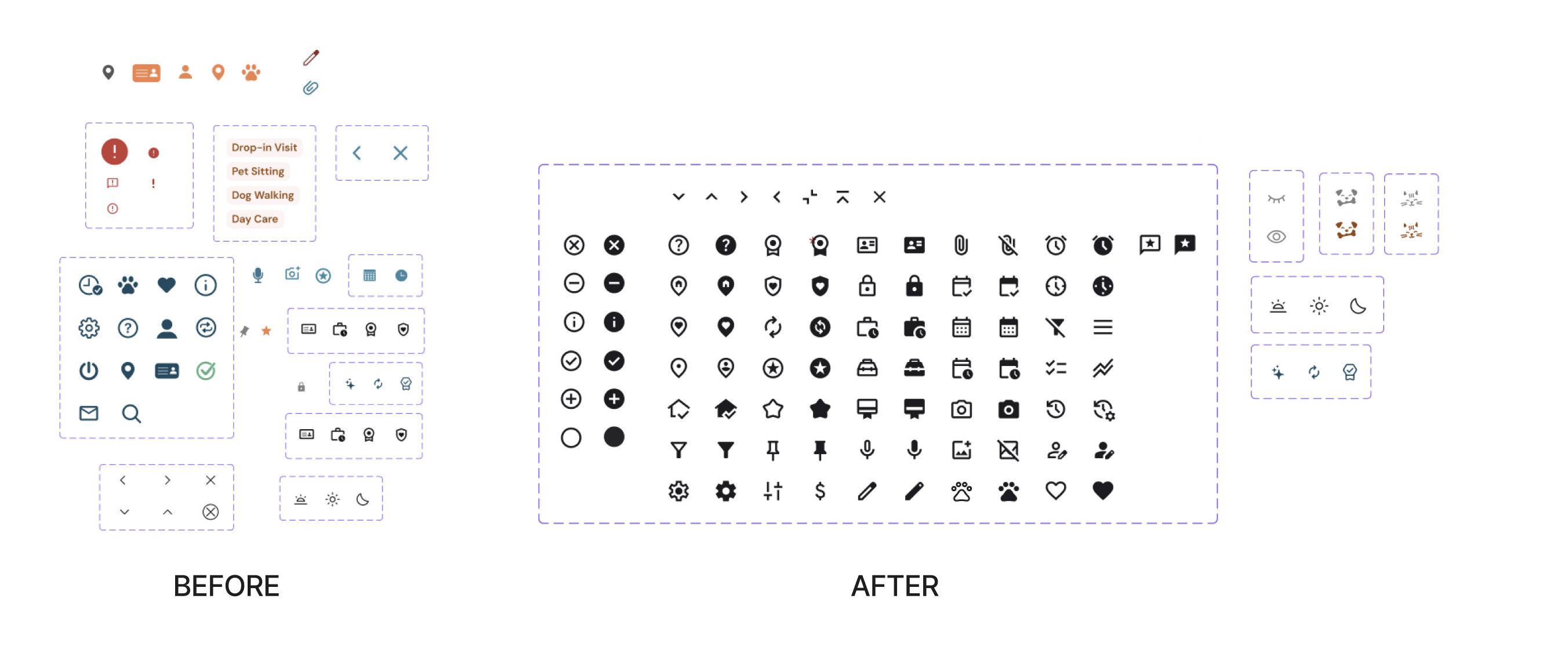
Standardized icon styling and visual weight for consistency across navigation. Created filled and outline icon variants for clearer active/inactive states, improved accessibility, and native mobile interaction patterns.

Unified and expanded icon system

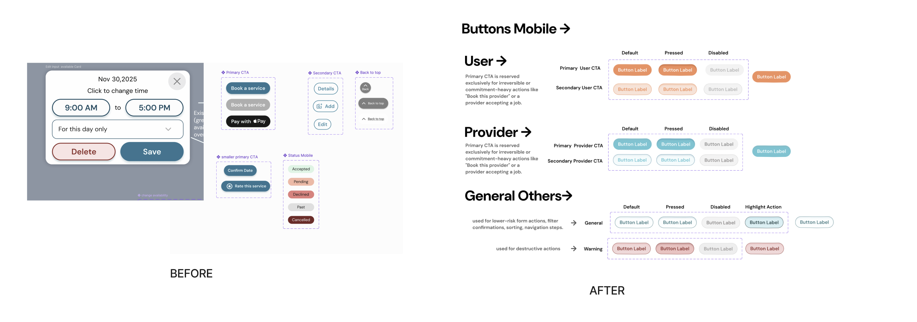
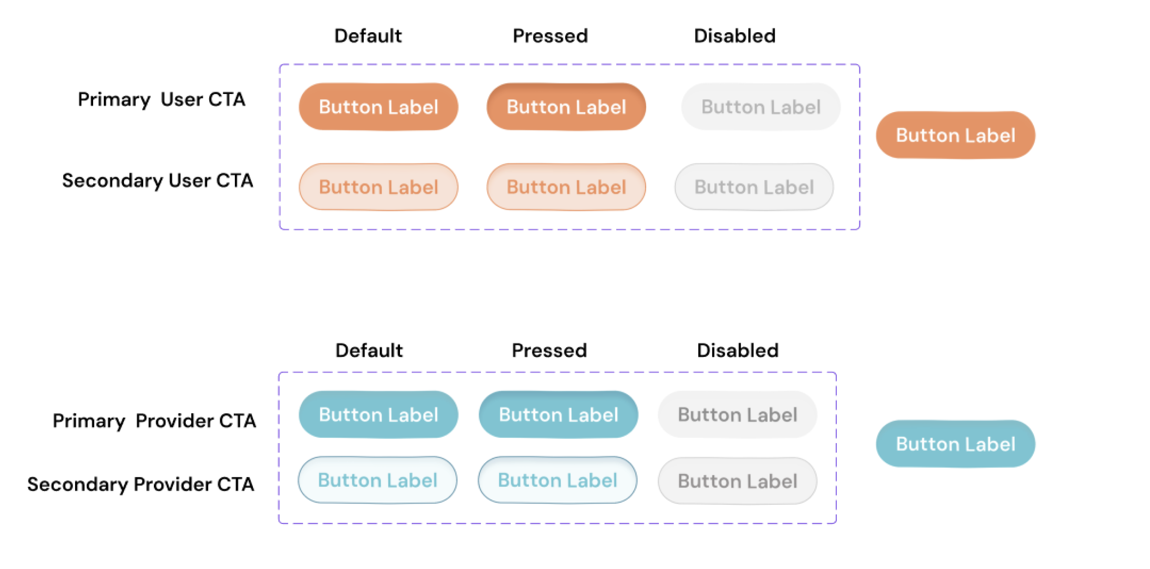
Replaced the single-button system with a three-tier CTA hierarchy that visually distinguishes high-commitment booking actions from secondary and low-risk utility actions.

Three-tier CTA hierarchy

Component organization built to hand off cleanly into a React Native codebase.

React Native-ready components

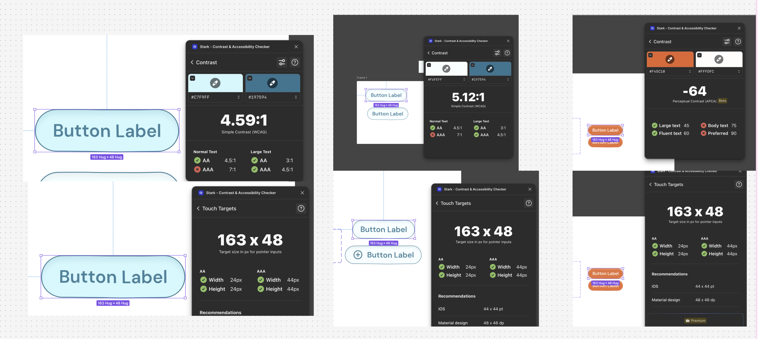
Ensured compliance with Apple HIG and WCAG touch target standards.

Accessibility improvements
The Outcome

A real product, with redesigned flows forming the live product foundation moving towards launch.

To support scalability and consistency across the marketplace experience, the redesign expanded TiriVelo's design system and interaction framework with a standardized typography scale, refined teal color palette, and accessibility-driven component sizing, ensuring the product could grow and evolve consistently well beyond the initial redesign.

Reflections

What the Testing Taught Me

The original services tab was designed to be non-interactive, display only. Every single participant attempted to tap service rows. The final iteration made them interactive, redesigning around what users naturally expected rather than what the design intended. User expectations consistently outweigh designer assumptions.

What I Would Do Differently

With more time, I would have run a second round of testing specifically on the edge case solution, and pushed further into the provider onboarding experience to understand trust from both sides of the marketplace.

Testimonial from Michael Navarro, CEO of TiriVelo Inc.
Next case file

RapiMD